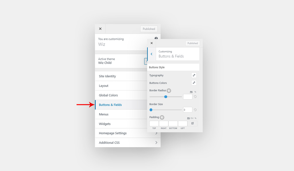
Customize theme global buttons and input fields style. You can find it under Appearance > Customizer > Layout > Header > Buttons & Fields.

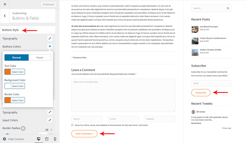
Buttons Style for Wiz WordPress Theme
- Typography: Customize buttons text font.
- Font Size: Set font size in px or em.
- Font Family: Select a font family from Google fonts library.
- Font Weight: Select font-weight, it will work depends on the selected font.
- Text Transform: Select the font transform: default, none, capitalize, uppercase and lowercase.
- Font Style: Select font style inherit, normal, italic and bold.
- Line Height: Set font line-height.
- Letter Spacing: Set font letter-spacing.
- Buttons Colors: Pick a color for buttons.
- Normal:
- Text Color: Pick a color for buttons text.
- Background Color: Set a color for the background of the button.
- Border Color: Select a color for buttons border.
- Hover:
- Text Color: Pick a hover color for buttons text.
- Background Color: Set a hover color for the background of the button.
- Border Color: Select a hover color for buttons border.
- Normal:
- Border Radius: Set border-radius for theme buttons. You can set a different value for desktop, tablet and mobile.
- Border Size: Set size for theme buttons border.
- Padding: Creates space around the button text. You can set spacing in Pixel (px), Em (em) and Percentage (%). You can set a different value for desktop, tablet and mobile.

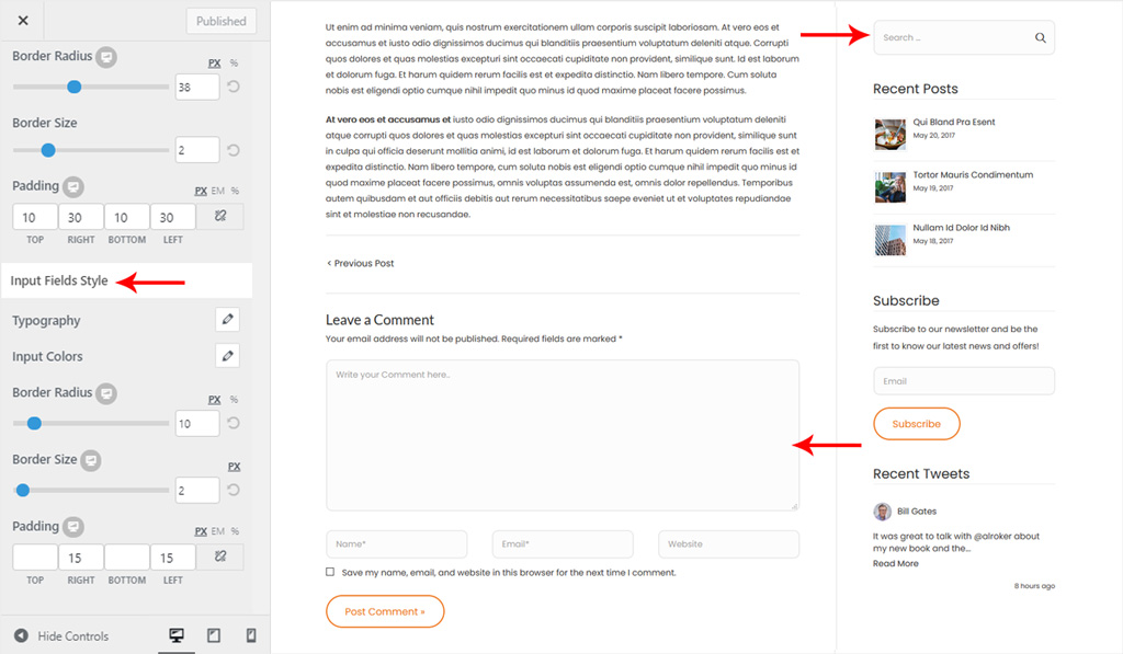
Input Fields Style for Wiz WordPress Theme
- Typography: Customize inputs fields text font.
- Font Size: Set font size in px or em.
- Font Family: Select a font family from Google fonts library.
- Font Weight: Select font-weight, it will work depends on the selected font.
- Text Transform: Select the font transform: default, none, capitalize, uppercase and lowercase.
- Font Style: Select font style inherit, normal, italic and bold.
- Line Height: Set font line-height.
- Letter Spacing: Set font letter-spacing.
- Input Colors:
- Text Color: Pick a color for input text.
- Background Color: Set a color for the background of the input.
- Border Color: Select a color for input border.
- Label Color: Pick a color for input label.
- Border Radius: Set border radius for the theme input. You can set a different value for desktop, tablet and mobile.
- Border Size: Set size for theme input border. You can set a different value for desktop, tablet and mobile.
- Padding: Creates space inside the input box. You can set spacing in Pixel (px), Em (em) and Percentage (%). You can set a different value for desktop, tablet and mobile. You can set a different value for desktop, tablet and mobile.
